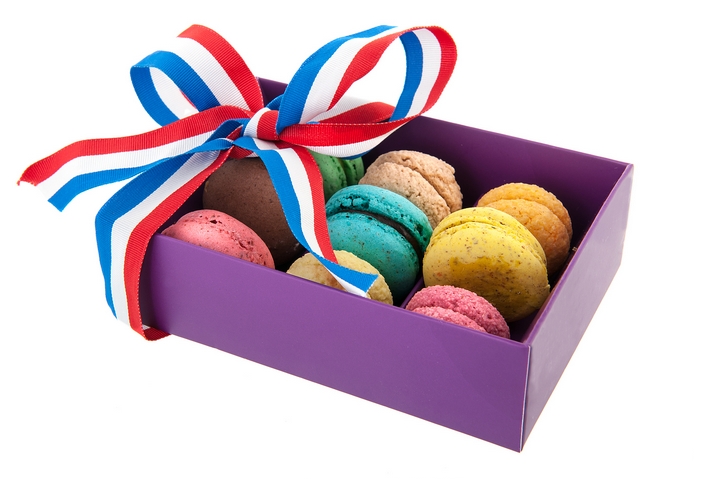
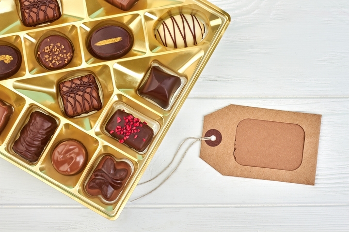
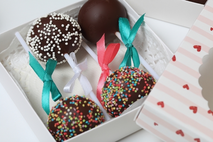
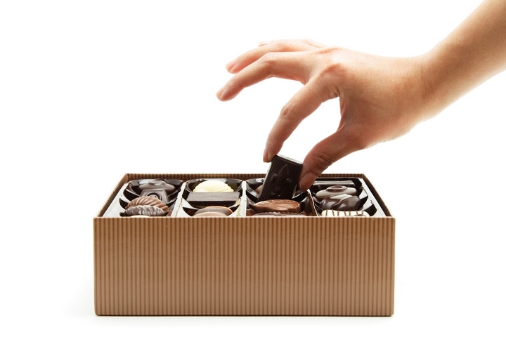
When it comes to giving a loved one a gift, nothing can truly beat a good box of chocolate. Chocolate boxes can work for virtually any special occasion, from Valentine’s Day to an anniversary. Once your special someone receives that package, they’ll immediately know they’re in for a good time.
The design of your chocolate box is significant for making a good first impression. Many consumers look for a chocolate box that comes with beautiful and stylish packaging. When the visual component of your food packaging is aesthetically pleasing, the product will appeal to more potential customers. The appearance of the chocolate box packaging helps to assure your customers that they will be purchasing a very special treat!
If you are looking for chocolate box packaging inspiration, check out these seven design elements!
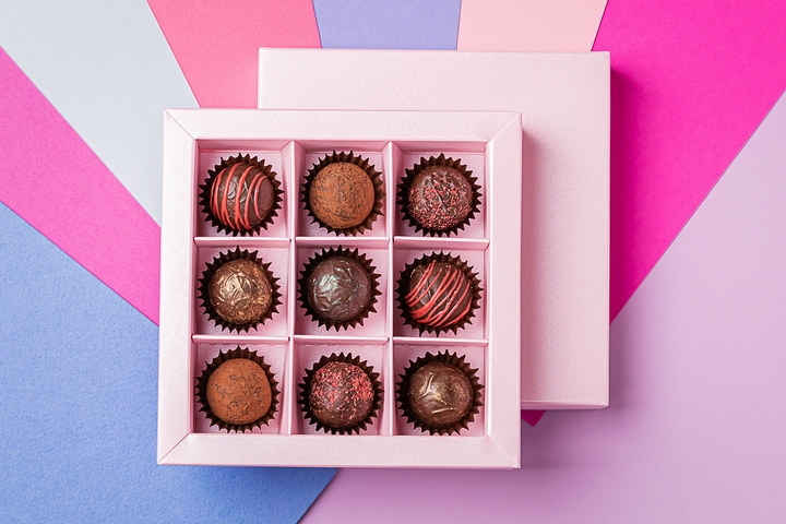
1. Minimalist Box Packaging
The best chocolate box packaging ideas are usually minimalist in design. For those who are fans of local confectionary companies, you’ll instantly recognize their packaging. That is because many of these businesses market their chocolate boxes with a minimum amount of information. When in doubt, choose a minimalist approach for your overall design.
Not only does this convey a sense of extravagance, but it maintains a balanced sense of simplicity. Your chosen colour palette should include only a few shades, to replicate a minimalist theme. When your packaging information is kept to a bare minimum, a better message will be translated.
2. Quirky Box Packaging
If you are selling your chocolate boxes to a niche market, it is important to inject personality into your food packaging. For example, if your target demographic is children and adolescents, make your box’s design quirky. Use colours and imagery to make your product seem amusing and fun.
As it pertains to the actual imagery, use visuals that fall in line with your brand. A chocolate box that has cartoonish designs, for example, will work effectively. When a packaging design has a striking visual appeal, the better it will stand out amongst the competition!
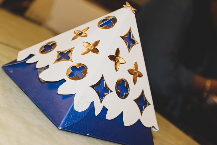
3. Geographically Inspired
Themes are incredibly important, in the context of creating a memorable packaging design. The same sentiment applies to chocolate box packaging. If your product is made in different parts of the world, use this to your advantage. Design the packaging with art inspired from that area.
Since cocoa is the main ingredient used to make the confectionary, it’ll likely be imported from another country. Should it come from Peru, for example, use Peruvian art to inspire your packaging. This could translate into future sales, as international art is a great way to draw in customer eyes.
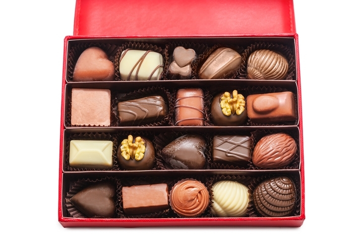
4. Luxury Box Packaging
Lindt is one of the most popular companies in the world, due to its delectable product line. When it comes to marketing their chocolates, a sense of wealth and luxuriousness is used efficiently. In regards to the actual box’s packaging, the materials are used to great effect.
If this sounds enticing to you, it’s because it should be. Wrapping your chocolate box in a golden ribbon helps accentuate the product’s worth. Use cursive fonts, and a couple bold colours to bolster this sentiment. Chocolate boxes are considered to be a great gift, so amplifying it with a lavish-inspired packaging makes it more desirable.
5. Seasonal Packaging
Although boxes of chocolate are an excellent gift, they can be much more special during a specific season. Nothing beats unwrapping a gift during the holiday season and finding a delicious chocolate box. As such, if the holiday season approaches, use imagery that is consistent with this time of year.
A chocolate box that exudes this theme can be very popular with younger demographics. A colourful box layered with snowmen or Christmas trees can bring a smile to any kid’s face. Or, decorating your box’s packaging with Jack-o’-lanterns for Halloween is also a great idea. Use the season to your advantage!
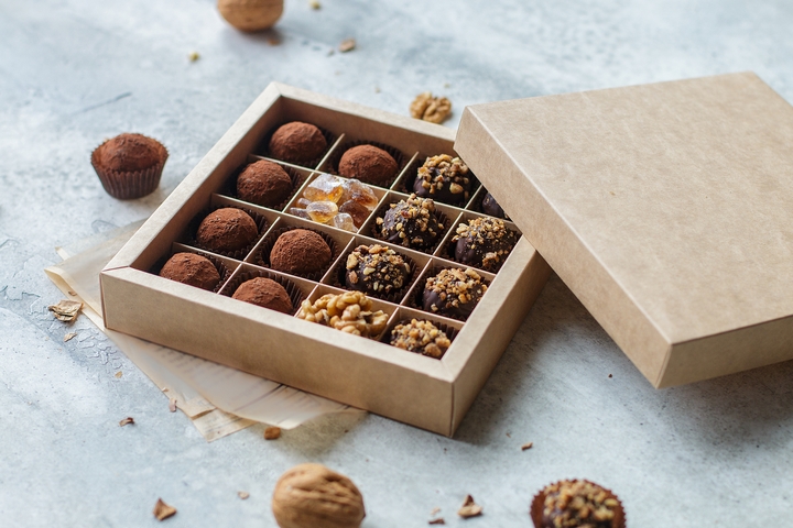
6. Illustrations
If you are trying to make your simple packaging design stand out more, use a single illustration. When implemented correctly, illustrative designs can enhance your box’s visual appeal. If the image remains consistent with your chosen colours, you got something magical on your hands.
7. Use Negative Space
Don’t forget to use available space effectively! The more empty space there is, the better it is for your brand information to stick out. Trying to fill the entire packaging with pictures or data is counterproductive. Ensure there is enough space to complement your chosen theme.